Simplifying Crypto for Newbies

Blockchain

Desktop

UX Design

During a 12-week sprint, I collaborated with 8 designers, 5 developers, 8 strategists, and 6 researchers to optimize user workflows and refine information architecture for new users on a new Kadena blockchain, K-Block.

Simplifying Crypto for Newbies

Blockchain

Desktop

UX Design

During a 12-week sprint, I collaborated with 8 designers, 5 developers, 8 strategists, and 6 researchers to optimize user workflows and refine information architecture for new users on a new Kadena blockchain, K-Block.

Simplifying Crypto for Newbies

Blockchain

Desktop

UX Design

During a 12-week sprint, I collaborated with 8 designers, 5 developers, 8 strategists, and 6 researchers to optimize user workflows and refine information architecture for new users on a new Kadena blockchain, K-Block.

Client

Morgan Denner

Role

UX Design Lead

Date

Feb '24 - May '24

Website

Client

Morgan Denner

Role

UX Design Lead

Date

Feb '24 - May '24

Website

Client

Morgan Denner

Role

UX Design Lead

Date

Feb '24 - May '24

Website

Product Overview

User-Friendly Blockchain Explorer for Beginners

Our client wanted to provide a user-friendly blockchain explorer and analytics experience for beginners in the blockchain space. They wanted to help “newbies” understand:


  1. How to view and track transactions

  2. Blockchain data

  3. Learn blockchain basics

  4. See market trends easily.

My Role

Lead UX Designer

I led a UX team of 8, working closely with developers, writers, researchers, and project managers during a 12-week phase cycle. Together, we focused on collaboration to ensure a user-centered final product.

My Role

Lead UX Designer

I led a UX team of 8, working closely with developers, writers, researchers, and project managers during a 12-week phase cycle. Together, we focused on collaboration to ensure a user-centered final product.

My Role

Lead UX Designer

I led a UX team of 8, working closely with developers, writers, researchers, and project managers during a 12-week phase cycle. Together, we focused on collaboration to ensure a user-centered final product.

The Problem

A Steep Learning Curve

Before addressing the needs of the client, navigating the current K-Block experience as a crypto newbie is near to impossible with the following issues.

The Problem

A Steep Learning Curve

Before addressing the needs of the client, navigating the current K-Block experience as a crypto newbie is near to impossible with the following issues.

The Problem

A Steep Learning Curve

Before addressing the needs of the client, navigating the current K-Block experience as a crypto newbie is near to impossible with the following issues.

Hard to Get Started

New users find it hard to know where to start exploring on K-Block. The lack of guidance leaves them feeling lost and uncertain where to begin.

Investment Hesitation

Without clear information, users hesitate to make investments. This uncertainty stops them from taking action.

Too Much Data

K-Block’s extensive data can be overwhelming for beginners. The sheer volume of information makes it difficult to grasp the basics.

Discovery

Addressing User Confusion

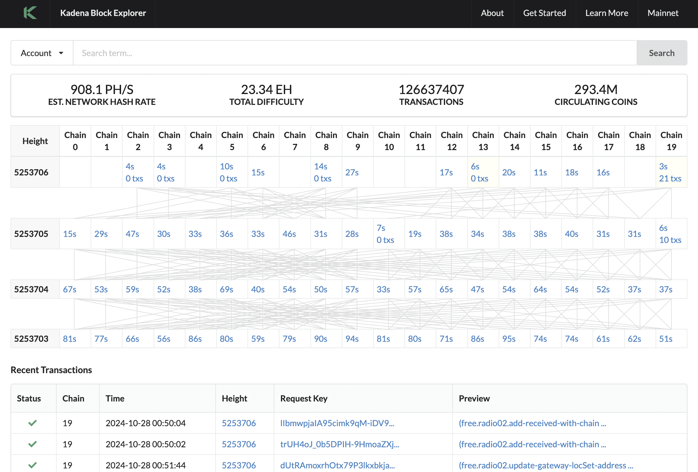
Previously, there was only a homepage with a confusing data table that lacked clear explanations, making it hard for users to know what actions to take next. Users needed a better experience to create a wallet, view transactions, stake tokens, swap assets, and view wallet details on a blockchain website.

Research

Data Driven Insights

Research insights highlighted essential needs like intuitive navigation and accessibility, which shaped our development priorities. These findings ensured the product aligned with user expectations and improved overall usability.

Research

Data Driven Insights

Research insights highlighted essential needs like intuitive navigation and accessibility, which shaped our development priorities. These findings ensured the product aligned with user expectations and improved overall usability.

Research

Data Driven Insights

Research insights highlighted essential needs like intuitive navigation and accessibility, which shaped our development priorities. These findings ensured the product aligned with user expectations and improved overall usability.

Iteration

Crafting Consistency

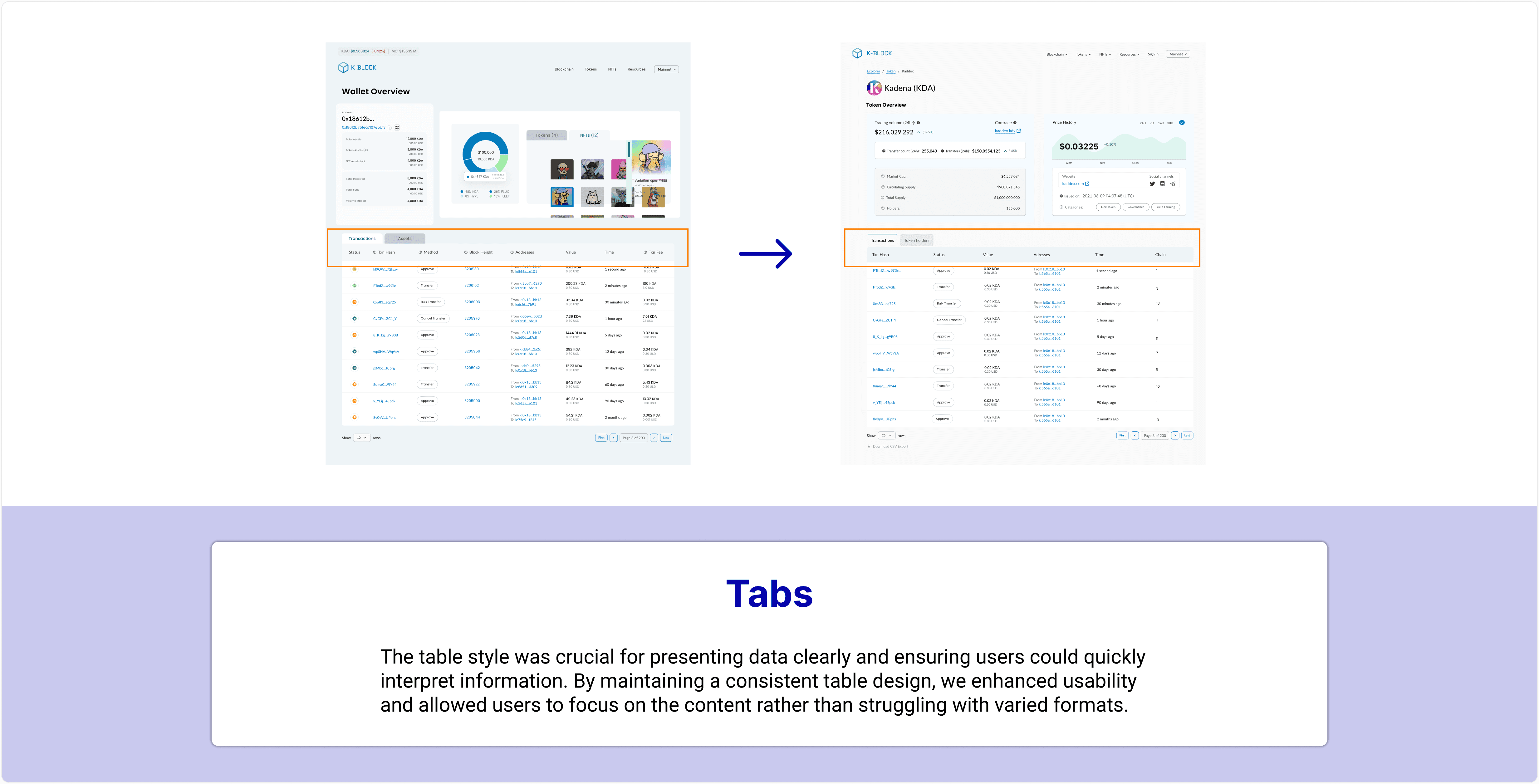
We iterated through multiple feedback rounds to ensure consistent design, refining typography, background colors, and table styles for clarity and cohesion. This process created a polished, user-friendly experience.

Iteration

Crafting Consistency

We iterated through multiple feedback rounds to ensure consistent design, refining typography, background colors, and table styles for clarity and cohesion. This process created a polished, user-friendly experience.

Iteration

Crafting Consistency

We iterated through multiple feedback rounds to ensure consistent design, refining typography, background colors, and table styles for clarity and cohesion. This process created a polished, user-friendly experience.

Design Impact

K-Block

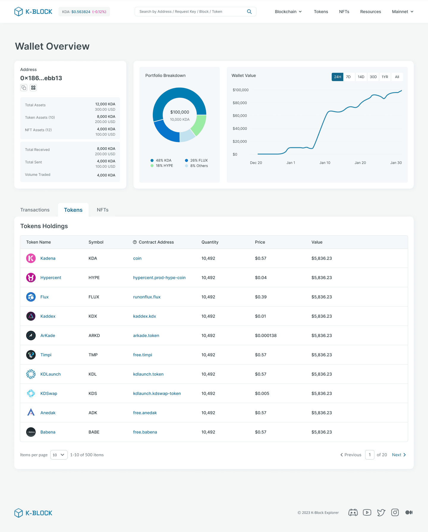
The final design includes a user-friendly homepage that centralizes key features such as wallet details, block information, and NFT management. Each page is crafted to provide essential information at a glance, ensuring users can easily navigate and interact with their digital assets.

Developement

Backend Developement Constraints

Before addressing the needs of the client, navigating the current K-Block experience as a crypto newbie is near to impossible with the following issues.

Developement

Backend Developement Constraints

Before addressing the needs of the client, navigating the current K-Block experience as a crypto newbie is near to impossible with the following issues.

Developement

Backend Developement Constraints

Before addressing the needs of the client, navigating the current K-Block experience as a crypto newbie is near to impossible with the following issues.

Easy Data Access

  • Custom Indexing: Designed search and filter options to quickly find transactions.

  • Data Management: Simplified data views for easier analysis without overwhelm.

  • Data Processing: Created clear visual distinctions between blocks and transactions.

Reliable Set-Up

  • Node Connections: Developed connection indicators for real-time stability cues.

  • Node Setup: Designed onboarding with wait-time guidance for a smoother experience.

  • Node Literature: Crafted user-friendly documentation to boost user confidence

Real-Time Monitoring

Block Streaming: Designed dashboard updates to keep users informed without overwhelm.
Data Transfer Functions: Created intuitive visuals for tracking transaction flows.
Block Explorer: Streamlined search tools for effortless data location.
Real-Time Strategy: Enabled smooth refreshes for current information without disruption.

We chose competitors like FastAPI for quick API development, PostgreSQL for effective data storage, and a Custom Data Node for enhanced data retrieval. However, we struggled with a lack of backend and full-stack developers.

Next Steps

Refining the UI

The next team will focus on refining the design and UI for K-Block through several key tasks:

  • Finalizing additional screens to align with the new Information Architecture for consistency

  • Developing a Figma prototype for testing and feedback

  • Updating the codebase in collaboration with Front End Developers for seamless integration